

date. 2020 Aug-Sep
my roll. UX/UI designer
The National Security Agency
Government Agencies Site Redesign Challenge
Project Overview


What I do

National Security Agency (NSA)

The National Security Agency/Central Security Service (NSA/CSS) leads the U.S. Government in cryptology that encompasses both signals intelligence (SIGINT) and information assurance (now referred to as cybersecurity) products and services and enables computer network operations (CNO) in order to gain a decision advantage for the Nation and our allies under all circumstances.

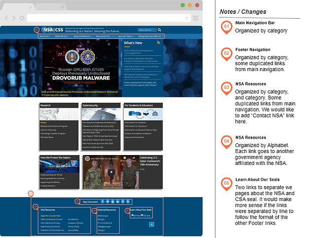
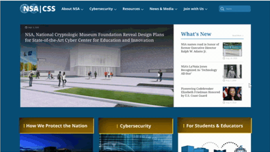
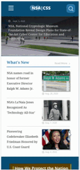
Current NSA website
This is the current (11/22/20) website page of NSA. The main homepage looks pretty clear but the top navigation menu is too complex. Also, a page with a lot of texts (like the declassification page) is too wordy and all information is showing.


Proto Persona

Our user, Coral O’Brien, is a history journalist in DC. She visits the NSA website to find documents.
Goal: to review declassified documents for an upcoming news story she is writing on the history of the VENONA project and to reach out to the NSA representative for her story.
Pain Point: difficulty to search for the documents, the website homepage is text-heavy
Typical User Path
We tracked the user path to achieve Coral's goal: Find declassified documents about the VENONA project and look up the NSA representative's contact number.
She had a hard time searching for the documents. Also, the website is text-heavy so she felt tired after using the website.

Usability Testing : Plan
The objective of conducting guerilla testing is to test the usability of the NSA website.
We want to gain insight into navigating the home page, finding information on declassified documents, and finding contact information for the NSA.

Usability Testing : Result
We observed that most users are having trouble to search the document on the declassified document page and find the contact us page.

Affinity Diagram
Based on the opinions from the usability testing, we made sticky notes and group them to contact information, searching for info, find declassified document page, and navigation bar. The problem of the current NSA website is [contact information was expected to be at the bottom of the page but it was not], [searching in the long list made finding link difficult], [finding "declassified documents" page needs to be more intuitive], [users need a way to search in the lists], and [how to navigate dated documents need to be more clear].

Empathy Map
We create the empathy map to understand Coral's actions, feelings, gains, and pains in a visual way.

Prioritization Matrix
The high priority features that need to redesign are [to make homepage navigation more intuitive] and [to organize the declassification page].

Annotation of usability and heuristic issues

For the news features, the picture is not auto-resizing to fit the frame. If the picture is landscape orientation, it is fine; but in portrait, it has too much space.

On the declassification documents page, there are no search or sorting options even it has a lot of document links. The NSA homepage has a search bar on the top, but it is for the entire homepage.

I defined the organization schemes that logical grouping of items to define relationships between content items and groups because contents could have a more clear and logical structure.
LATCH Analysis & Heuristic Evaluation

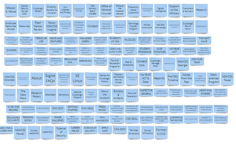
Card Sorting
The NSA website's top navigation contains lots of categories and subcategories. We both agreed that it needs to be more clear in a logical way. We put every category and subcategory into sticky notes and organized it into simpler groups.
Redesigned Sitemap
The next step is to re-organize sticky notes into a sitemap, that I could use on my wireframes.

Wireframe: Web version / Mobile version
The webpage design in nowdays, should be responsive to different devices, regardless of desktop, tablets, or phones.


Clickable Prototype: Web version / Mobile version


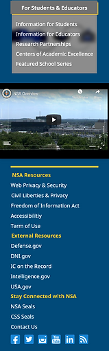
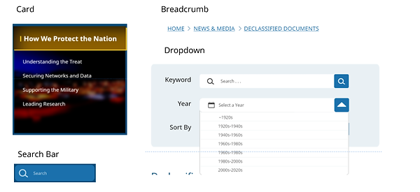
Top navigation
Web version- Main Page


Mobile version-Mainpage
Side menu navigation
.png)
web version-Mainpage
UI Components
.png)
Mobile version-Mainpage
.png)
News card & other components
.png)
.png)
UI Style Guide

High-fidelity Prototype : Web version
High-fidelity Prototype : Mobile version

Key Learnings and Takeaways
The main concept for the redesign is "to make it simple".
The purpose of the government website is to deliver organized information and it should be a reliable website.
The original NSA website has a fine color theme and branding, so I keep those and improved with modern design.
I spent a lot of time on card sorting and sitemap because it has numerous categorized (page) on the top navigation. I organized and clean it up with a new design of the top navigation.
In nowadays, people use their mobile devices to search for information. The web page should be responsive to the small mobile device page and keep the same information.
Thank you!

My Works
 |  |  |  |
|---|---|---|---|
 |